Informational Poster
Graphic Design • Vector Drawing
Course: Visual Communication & Design
Timeline: October 2024
Programs used: Adobe Illustrator
Design Project Objective
Using the object I picked for the entire semester, I needed to create an informational poster about it. It requires researching and writing 50-250 words to arrange the design. A diagram is also included to convey information concisely using visuals.
Sketches Drafts
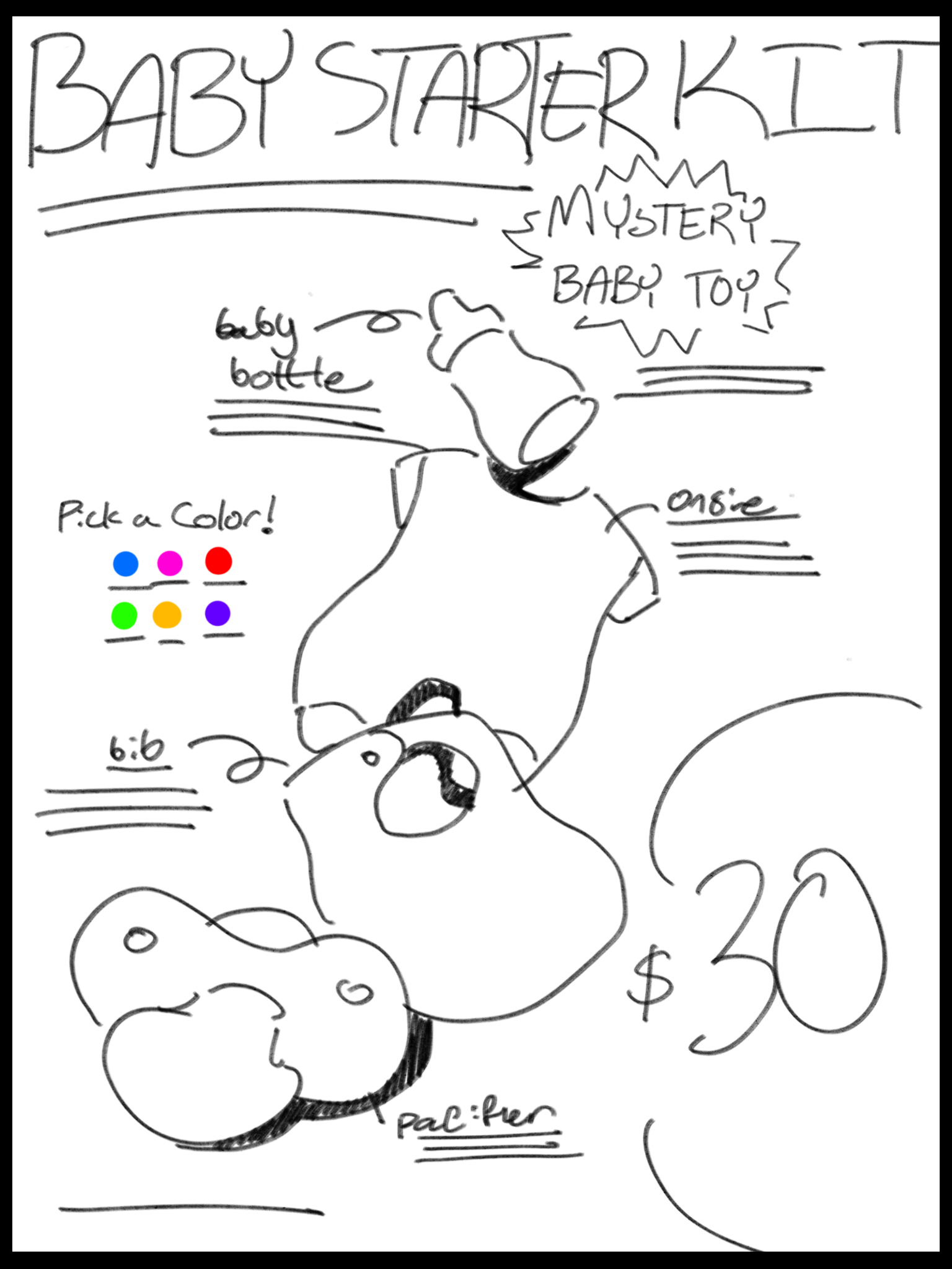
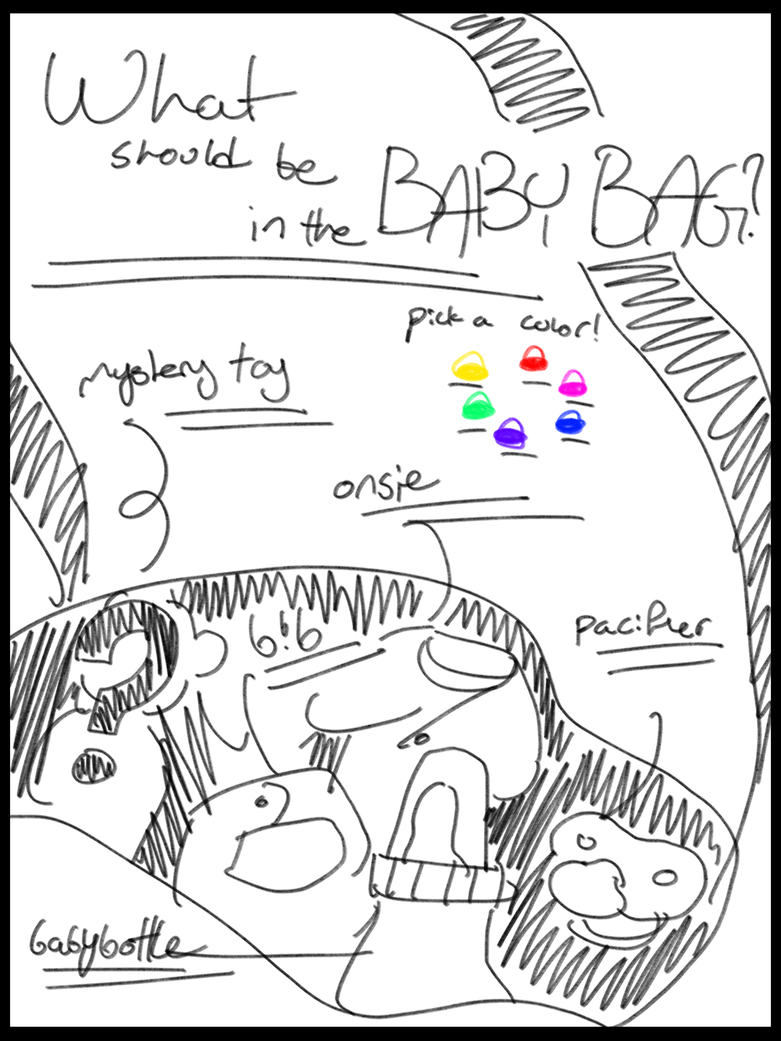
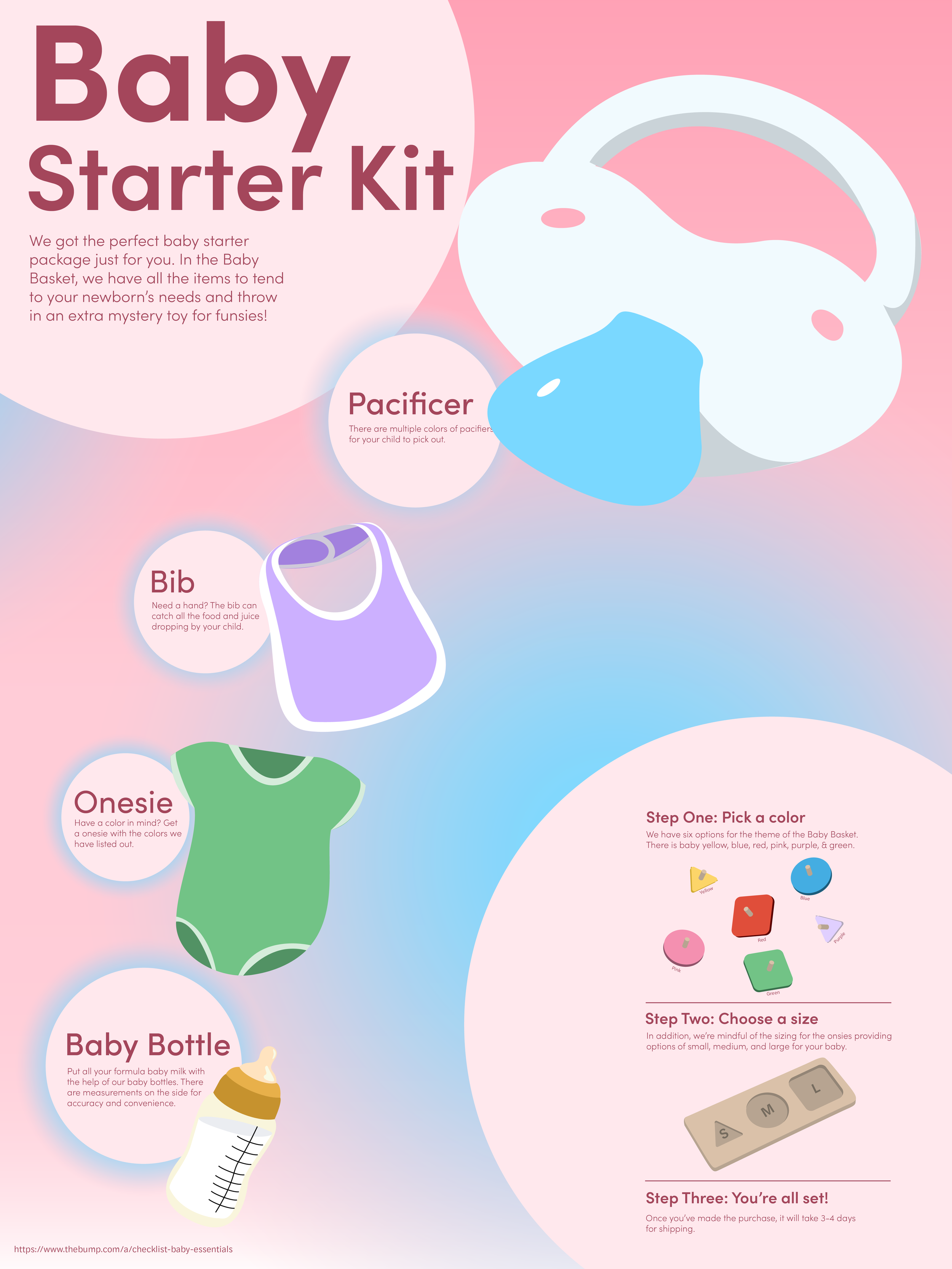
I had leeway to make my poster an informational advertisement so I based it on a product called “Baby Basket” which contained many baby products in a bundle. I created different titles for each version, wanting to play off the literal objects like the “bag” or “basket.” The most important aspect for me was working on the flow of information to see if it was easier for the viewer to read everything in a specific order. I picked the first one because of the simple composition and how easy it was to read the information.

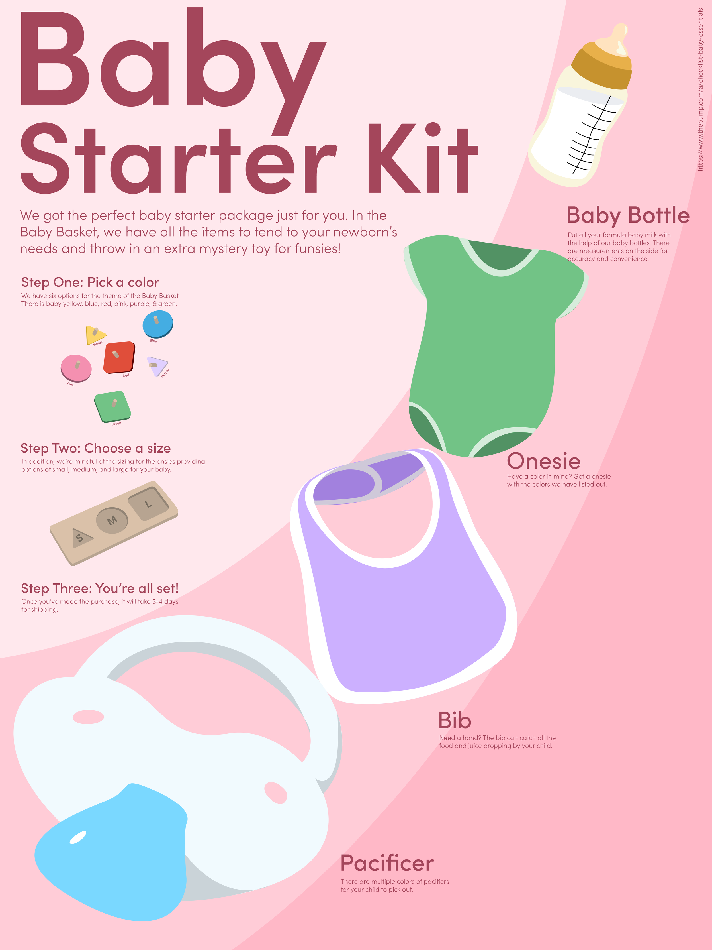
Working on Hierarchy
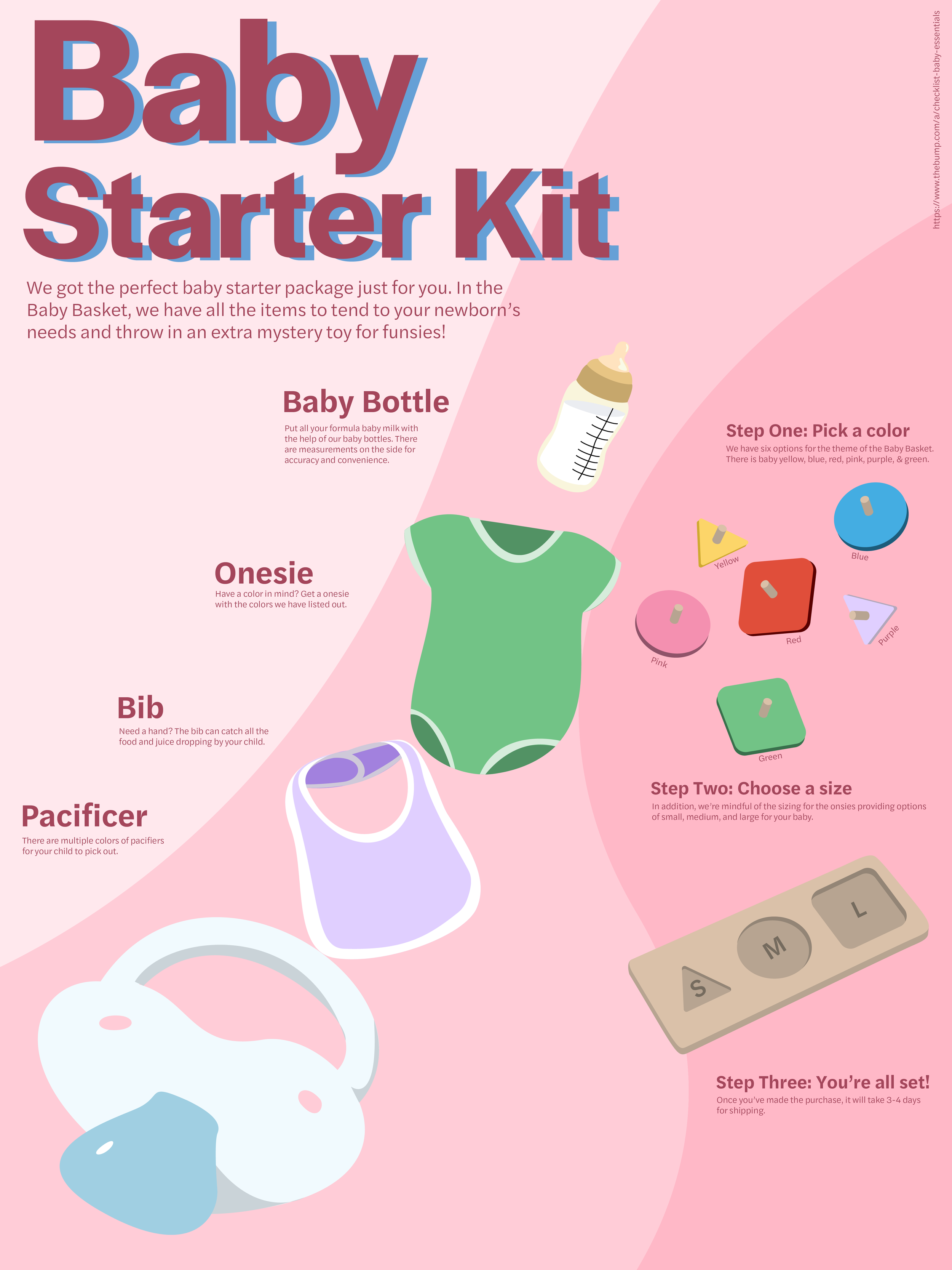
After creating all the elements and pasting the text for the poster, I was figuring out how to re-arrange everything to make it work. All the text and illustrations were the same size. They needed to be differentiated and contrasted from each other to indicate what is heading, subheading, and whatnot. Additionally, I made the illustrations different sizes to create a focal point and order of information to read. In the final version, I made headings in different colors from the body paragraphs.
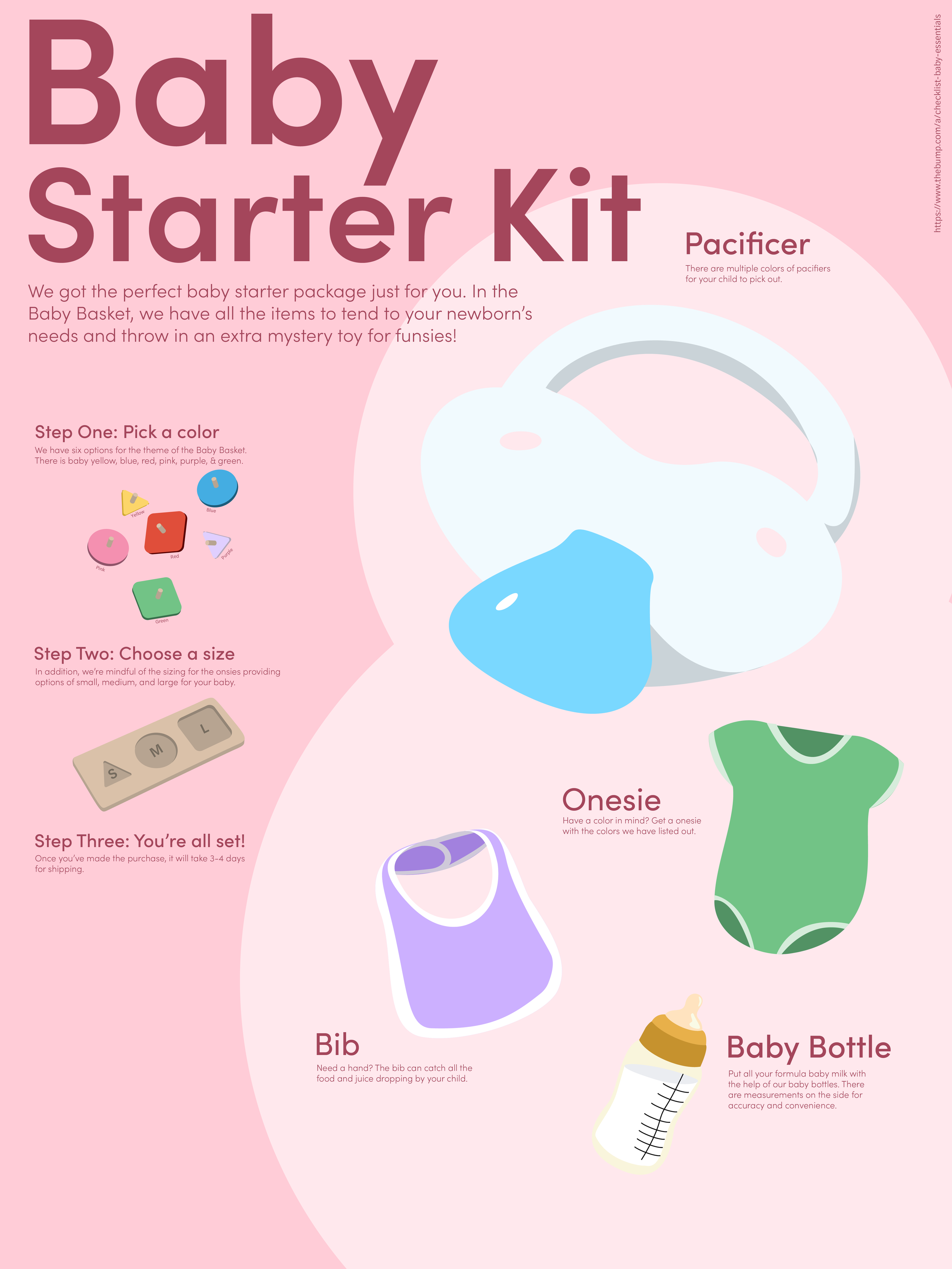
Working on Compositions
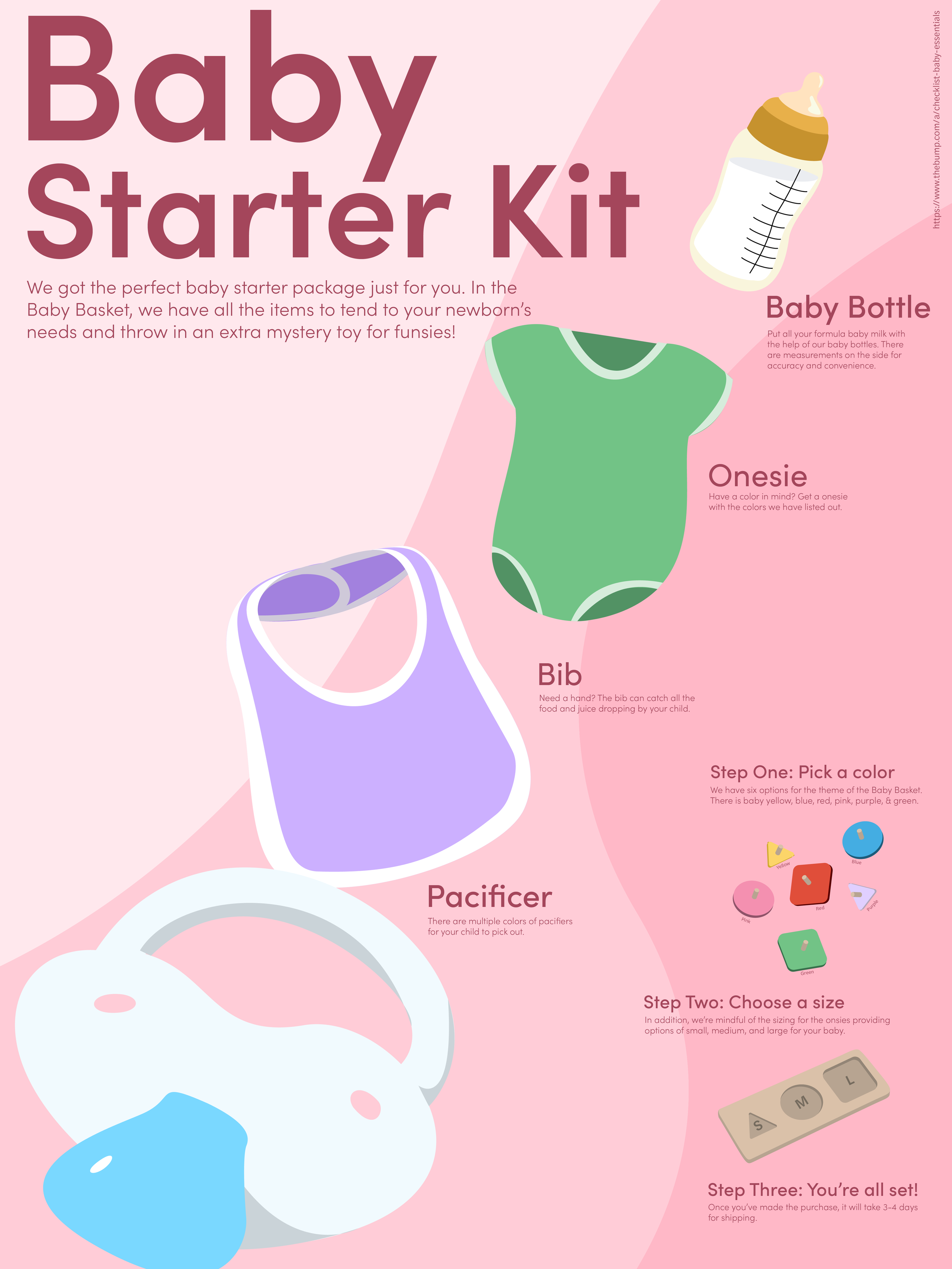
I was not satisfied with how I arranged the elements, so I experimented with ways to use the space on the canvas. The goal was to leave space so certain information was blocked as groups while making it feel dynamic and simple.

Adding Color & Details
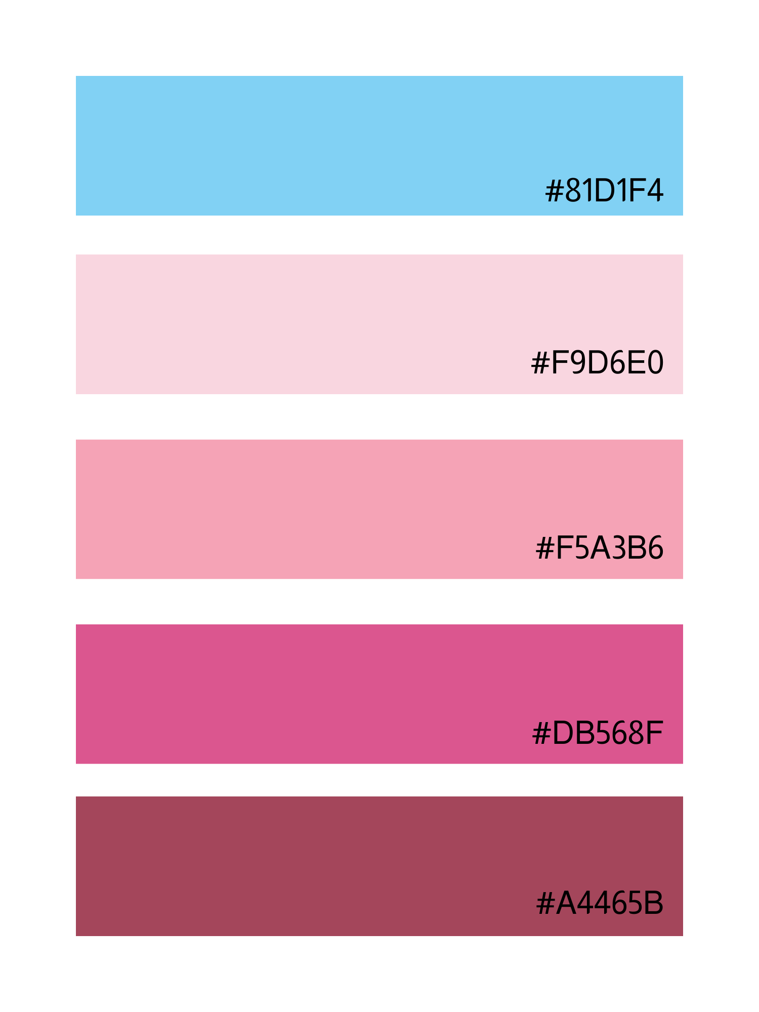
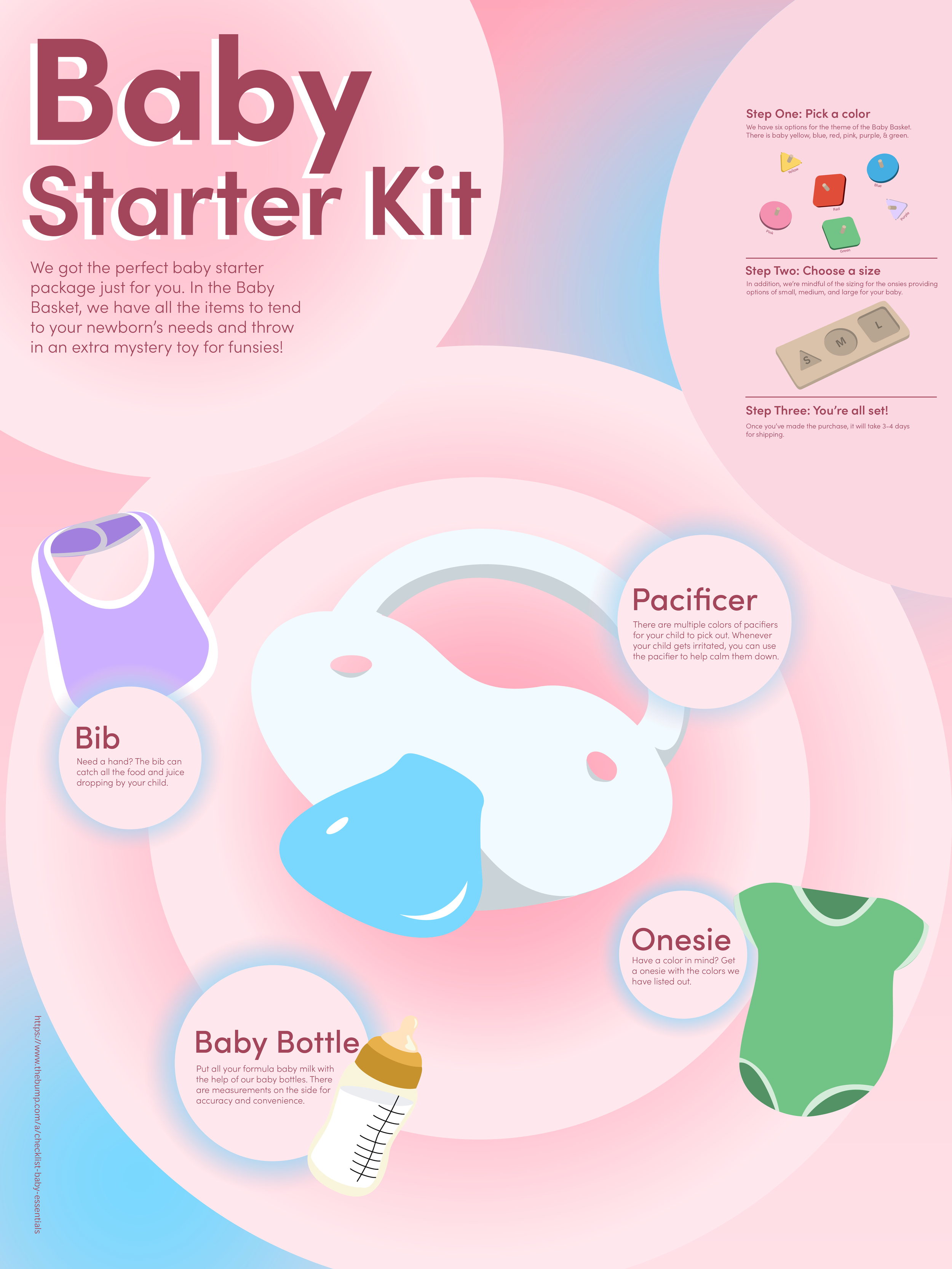
When finalizing the colors, I wanted to pick two distinct colors so there was more captivating. I decided to enhance the circular elements to give depth with the baby blue serving as a pop of color. The gradients, pastel colors, and bubbly elements helped with the brand image for the product targeting parents with newborns.
Final thoughts
The project itself was challenging from brainstorming a vague concept to making the design look cohesive and eye-catching. I wanted to note that the font does look smaller, but the poster was printed with 15 x 20in dimensions, making all the words legible.


